SpendSavvy
A fintech dashboard with multi-party payouts and real-time spend analytics.
01 / The problem
SpendSavvy is a fintech dashboard I built full stack for a client. It moves money between several parties and shows spend as it happens.
02 / Decisions
Stripe Connect for payouts
Multi-party payouts run through Stripe Connect, so money movement stays inside a provider built for it.
Aggregation in PostgreSQL
Real-time spend analytics come from optimised PostgreSQL aggregation, with consistency kept on transaction writes.
03 / The system
The shape of the system
04 / Results
- Live at spendsavvy.app.
More detail
SpendSavvy — Subscription Expense Tracker (Product Design Case Study)
SpendSavvy is a mobile-friendly expense tracking application designed to help individuals log spending, understand trends, and build healthier financial habits. The product uses a 3-day free trial model and then upgrades users to a $10/month subscription via Stripe, balancing value delivery with a clear monetization path.
This portfolio entry focuses on the product design decisions: user flows, UI structure, and the reasoning behind key experiences like trial gating, dashboard clarity, and analytics visualization.
Problem
Most personal finance tools feel overwhelming, overly feature-heavy, or demand too much setup before a user gets value. I wanted to design a product that:
- Helps users start tracking expenses immediately (low friction)
- Builds trust with a clean and predictable UI
- Shows value quickly with summaries + analytics
- Monetizes naturally after the user experiences the core benefit
Goals & Success Criteria
Primary goals
- Make expense logging fast and frictionless (especially on mobile)
- Provide clear insight: monthly totals, category breakdowns, and trends
- Use trial → subscription conversion without harming the experience
- Keep the interface modern, minimal, and consistent
Success criteria
- A first-time user can sign up and log an expense in minutes
- Users can understand “where money is going” at a glance
- Trial expiration is clear and non-confusing (no surprise lockouts)
- Subscription UX is direct, secure, and confidence-inspiring
My Role
- Product design for key user flows (trial, subscription, tracking, analytics)
- UI/UX decisions for mobile-first layouts and dashboard hierarchy
- Interaction design for forms, feedback, and states (loading/empty/errors)
Design Approach
1) Mobile-first, dashboard-first
The tracker is the core value of the product, so the design centers on a dashboard layout:
- A lightweight expense form
- An always-visible list of recent entries
- A summary panel that answers “How am I doing this month?”
On desktop, this becomes a split-view experience; on mobile it stacks vertically for clarity.
2) Minimal inputs, maximum clarity
Expense entry is intentionally simple:
- Date
- Category (presets + optional custom)
- Amount (2-decimal precision)
- Optional description (short, capped)
This reduces decision fatigue and improves completion rate.
3) Trial gating that doesn’t break trust
The product offers full access for 3 days after signup. After the trial ends:
- Users are redirected to payment when attempting gated areas
- The UI communicates subscription status clearly
- The “Subscribe” call-to-action stays consistent and predictable
Information Architecture (Pages)
The experience is structured as a focused set of pages:
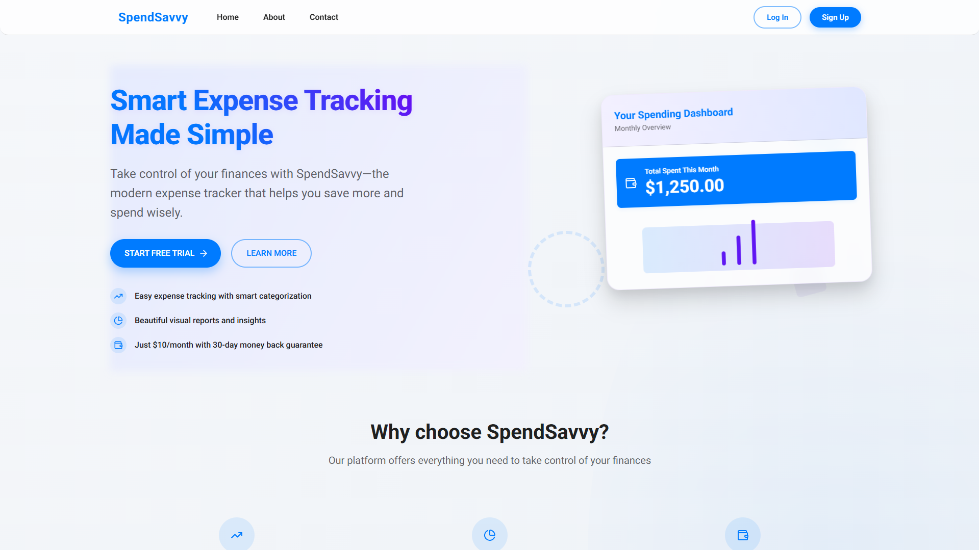
- Home — value proposition + “Start Free Trial”
- About — credibility + explanation of purpose
- Tracker (Authenticated) — form, history, summary, analytics
- Payment / Sign-up — Stripe checkout for $10/month
- Contact — support and feedback
This keeps the product easy to understand and avoids feature creep.
Key User Flows
Onboarding & trial activation
- User lands on Home and clicks Start Free Trial
- Signs up with email/password
- Trial begins immediately and user is taken to the Tracker
Expense tracking flow
- User adds an expense using the quick form
- Expense appears in the list instantly (newest first)
- Monthly totals and insights update to reflect the new entry
Subscription flow
- During/after trial, user sees a clear upgrade path
- “Subscribe” sends user to Stripe checkout
- After payment, access is fully unlocked
UI System (Brand & Visual Design)
Theme intent: trustworthy, clean, modern, and friendly.
- Primary color: #007BFF (actions, links, emphasis)
- Background: #FFFFFF (clarity and simplicity)
- Surface: #F5F5F5 (tables, panels)
- Text: #333333 (high contrast)
- Positive trend: #28A745 (growth/healthy change)
Typography (design spec):
- Roboto Regular for headlines/body
- Roboto Light for footer/secondary UI
Analytics & Insight Design
To help users understand their spending beyond raw entries, the dashboard includes:
- Total spent this month
- Trend indicator (e.g., “Spending up 10%”)
- Category breakdown (bar chart)
The goal is to transform logging into learning—without overwhelming the user.
Implementation Notes (What was built)
Although this portfolio entry is design-led, the product was implemented as a real app:
- Next.js + TypeScript
- Tailwind CSS (UI styling)
- Chart.js for dashboards
- Auth + gated access for trial/subscription model
- Stripe integration for recurring billing
- MongoDB/Mongoose for storing users and expenses
- Deployed on Vercel (public site: https://spendsavvy.vercel.app)
What I’d Improve Next
If I extended SpendSavvy further, I’d focus on:
- Budget goals + “remaining this month” indicators
- Recurring expenses and reminders
- Export to CSV/PDF
- Better onboarding prompts (category suggestions, sample data)
- Integrations (e.g., Plaid) while keeping the UI minimal
Takeaway
SpendSavvy was an exercise in designing a simple but monetizable consumer product: deliver value quickly, build trust through clarity, and introduce payment at the right time using a trial that feels fair. The result is a focused expense tracking experience that prioritizes speed, insight, and mobile usability.
Next project
ImaginAI